Brand
Our Brand Story
At the Montana Society of CPAs our mission and history define who we are. We inspire, empower and impact our members to achieve professional excellence. Every day we are focused on these words. Our new look highlights that dedication to our mission. The Society is recognized as a leader in the profession because of our legacy of being progressive and tackling the challenges of tomorrow.
The new brand highlights that we are distinctively Montana. No offense to our peers in the seven other M states, but they are not Montana and we are definitely not Massachusetts. To further differentiate ourselves, we are moving our web presence to montana.cpa and updating our acronym to MTCPA. These changes may take a while to get used to, but further focus us on being from Montana. We will have the mail forwarded for a while, so you can continue to use our MSCPA.org addresses.
Our look isn’t the only thing changing. We are also moving into a new space and launching this new website. These changes represent a change in our operations. The past couple of years have changed how we work and these changes represent a shift in investment from our physical to our web presence.
Since we were established in 1913, the Montana Society of CPAs has gone through a lot of change. Adapting to those changes created the legacy we inherited. We hope this new look will inspire the next generation to join our legacy.
Becoming a CPA establishes you as a trusted professional. Joining the Montana Society of CPAs help you leverage your credential to make an impact. When you make an impact, you leave a mark. Our new mark will signal to anybody who sees it that they can trust the information attached to it.
We would also like to thank the Branding Strike Force and welcome your feedback on the new look.
Our Mark
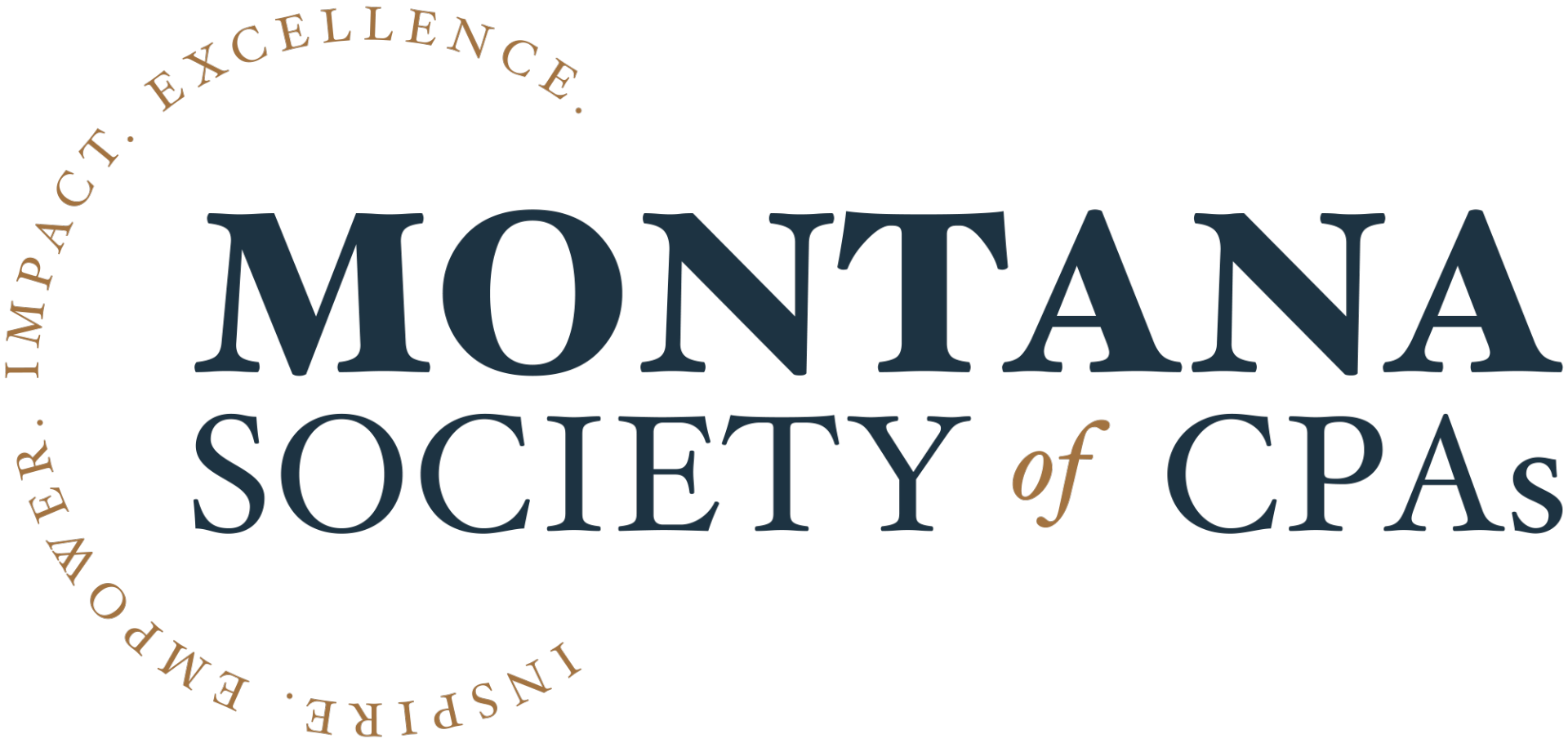
The core of our brand is a mark. Something people will easily recognize as Montana Society of CPAs. The new mark puts added emphasis on our Mission to inspire, empower and impact our members to achieve professional excellence. Shifting from our acronym to writing out the words in our name differentiates us from others. Depending on how the mark is used it can also contain when we were established. The branding committee felt strongly there is value in using the words Montana Society of CPAs when possible instead of our acronym. Each word in our name (except "of") holds importance and we worked very hard to properly balance them in the mark.
You may be asking yourself, where is the "thing." Our new mark uses words as graphical elements where in the past we had circles, abacus beads, and a pencil. Early options contained a number of different "things," but at the end of the day the committee was drawn to the simplicity of this look.
Our Colors
The Montana Society of CPAs was founded in Butte in 1913. Our new colors are focused on three core colors:
- Alabaster gives an aged touch to the brand elements.
- Copper references The Society’s history in the mining industry and gives the brand elegance.
- Sapphire adds rich contrast and brings a sense of stability.